The store is divided into two major zones. One houses the restaurant, while the other houses their sweet and ice cream junction.
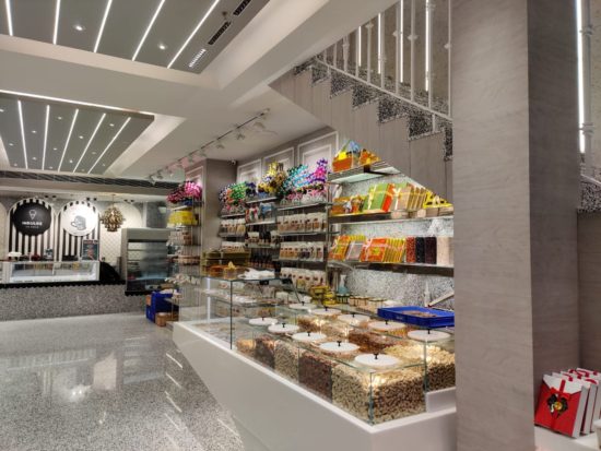
A wide array of materials, colors and textures have been nimbly translated into a humble yet luxurious ambience creating a harmonious zoning, circulation and visual flow within the outlet. A lush jewel toned color palette of purple, blue, green and gold is well balanced with neutral white and brown shades in the restaurant, creating a memorable and theatrical dining experience. On the other hand, a more neutral and formal colour palette of white and gold with a use of various playful textures complement the products on display, adding a certain warmth and depth to the retail space.
The interiors of the restaurant are influenced by the context of the city’s numerous monuments with the domed ceiling installations and the modern-day reliefs. Each purple toned dome with delicate relief work in white within encloses a household lantern inspired pendant light, creating a uniquely indulgent ambience. A curated pattern of window openings and solid surfaces in the vivid blue service counter creates a stark contrast to the interiors thus creating a fluid visual highlight, effortlessly creating an inside outside flow and converting an otherwise mundane cooking activity into a live art exhibit.
The spatial transition between the retail section and the restaurant is effortless and free flowing with a subtle yet consistent variation in the ceiling and flooring character, and the minimal product display acting like a screen, physically differentiating between the spaces but visually unifying them.
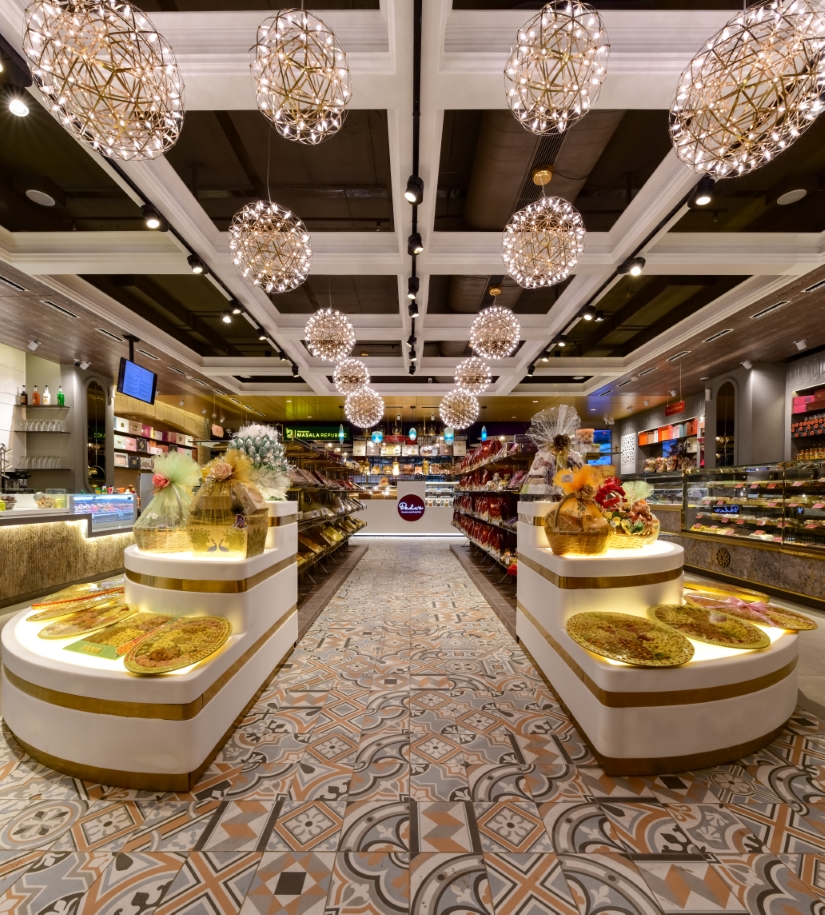
The main entrance opens into an elegant and dynamic space, flanked by the sweet and ice-cream displays on the either sides giving a quick overview of the entire product range, creating an alluring yet functional space. A grand central island display for the brand’s miscellaneous range and arty patterned tiles visually guide the customer to a smaller feature display and cash counter behind, which in itself forms the entrance to the restaurant.
The expansive and luxurious island display and the waffle slab inspired minimal ceiling, with minimal, spherical pendant lights create a warm, soft, golden glow that transitions into a matte gold ceiling towards the cash counter with quirky feature lights inspired by traditional lamps, before transitioning into the dramatic restaurant’s domed purple ceiling.
With a highly curated display system and an assortment of textures and colours brought together, the space exudes the warmth and extravagance of the royalty in a highly urbane and Avant Garde setup. Such intricate details along with suave furniture and a perfectly controlled lighting spectrum create a lavish and elegantly seamless spatial experience.
Aimed at reimagining Indian heritage into a cozy yet international retail experience, Dadu’s boldly goes beyond the expected to blur the boundaries between the old and the modern, creating a timeless piece of global retail experience. It is a true example of beauty lying in the details and deftly highlights the importance of contextual relevance of every project and its effect on both the urban fabric and the brand identity.